

Ok some of you have been asking questions about textures and lighting and such, so I thought why not just explain how I set up one of my renders. Ok so here goes. I'm not sure about the expertize level here. I'm sure there might be something interesting for everyone. If you've been around in Poser world long enough, you'll probably know most of this. Just ignore the parts you know.
Lets do the one with Sen and the Madal warrior about to beat the living shit out of each other.
With every render I do, or series of renders depending on the content, I split it up into two parts:
Figure setup and Scene setup
The reason I split them is because both can be just as intensive and when your moving around chairs or trees you don't want the process to be slowed down because of some huge ass figure like the Lali System in the scene.
Figure Setup
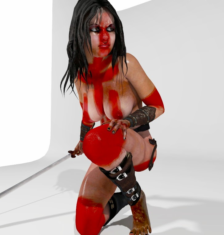
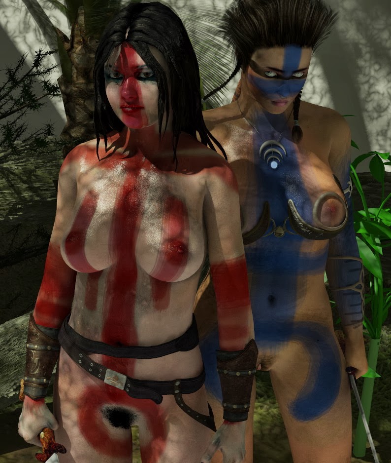
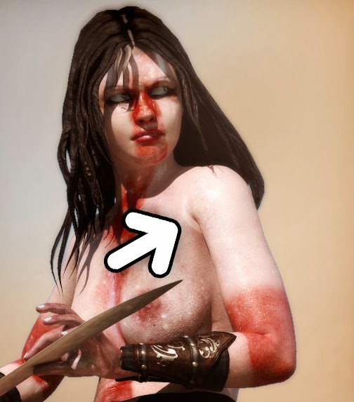 Ok so for this scene I wanted two Triplon warriors in some kind of pre-battle dance of intimidation across from each other. And these Trilpon guys are quite primal, with much theatre and intimidation going on in the way of bodypaint. They spend lots of time in the bush and because of the harsh and hostile conditions they rarely have time for a nice bath and so can get pretty grimy and dirty wondering around in a tropical environment. So the textures have to show this. This means shiny, bodypaint, random smears of grease and dirt of walking past vines and leaves that collect dust. Assuming that these guys don't have time to work with accurate paintbrushes the paint will also be smeared on by hand or with some simple animal hair brush. Any garments that they'd wear in this environment would probably be a rare item and therefore old and worn, and also dirty or rusted. So keywords are dirt, grime and grease.
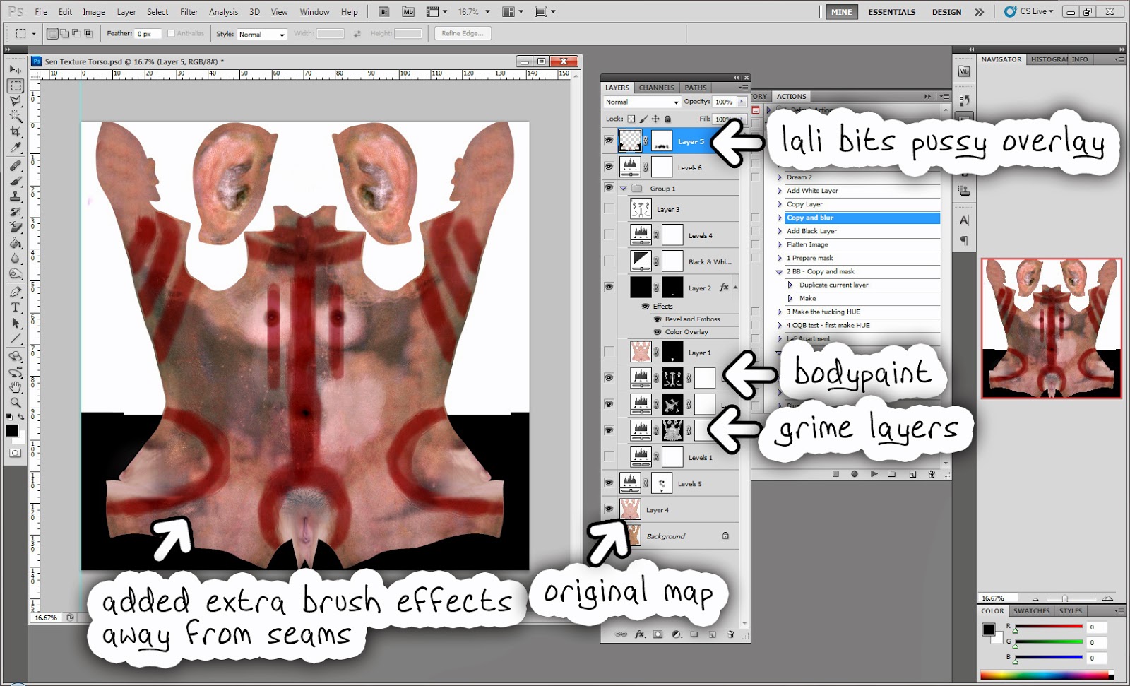
 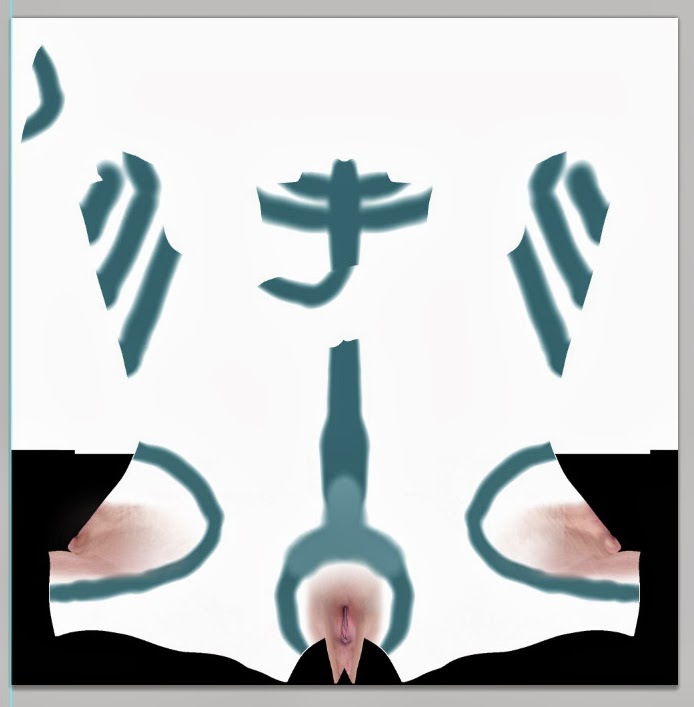 Sen, the figure you guys all already know was pretty much set up, but I was using an old texture I made back in 2010 and it had seam issues as you can see above. So I opened zBrush and painted on some new markings in my V4 mesh with PolyPaint. Exported it and here's the result. That you can use as a photoshop mask.
If you don't know about masks, it is a simple black and white panel that can he used as an overlay in any layer in photoshop. The black occludes the pixel information from the overall image. It works with any layer, from a simple bitmap to an adjustment layer like Hue or Levels.
 So using this technology, I can add dirt and grime with a darkening hue or deep contrast levels. One of the layers I did was a slightly higher contrast with a bump map acting as a mask. Go to the channels tab and select the 'mask'. There you can paste your black and white mask. With Sen's map I used the zBrush polypainting result ans added a bit of a paintbrush effect to the mask to give it that more scruffy look.
For the Madal warrior's map I was a little lazy because I didn't wanna go through the hassle of zBrush's interface and just painted myself a mask in Photoshop making sure to avoid the texture seams. In places where you know the seams join its no problem to draw over the scenes, also if you know they'll be hidden (like behind hair). So here's the quick and dirty result of the Madal warrior's map.
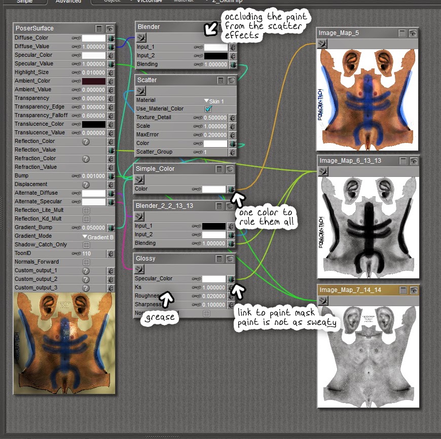 So now what to so in Poser? Well first of all it is skin, so set up some SSS skin node. Poser's skin nodes are becoming VERY easy and useful.
Off course paint is not skin so you'll need to use a blender node to occlude the SSS effects from the paint and let the diffuse node deal with it. In Photoshop you can take your texture and apply a 'Black and white' filter on it. Make sure you dial out the blue (or whatever color the paint is) to get a nice occlusion mask like you can see in the image. The occlusion mask attaches to a blender node that darkens the SSS value of where the paint is, and another blender going to the diffuse color does the opposite, filtering out the skin values and leaving just the paint.
TEST!!!!
So we render our babes together and see of their skins look decent. I made about 5 renders before being happy, but here's an example of three. The first one, Sen's textures were loaded up with a value of 1.05, making them too intense. I sometimes do that if I find the lighting too dull in a scene, like a poorly lit IDL room, or if I want Sen to look really disgusting. Its a lazy way but helps get quick results. In this case it probably wouldn't work, it might distract from the composition.

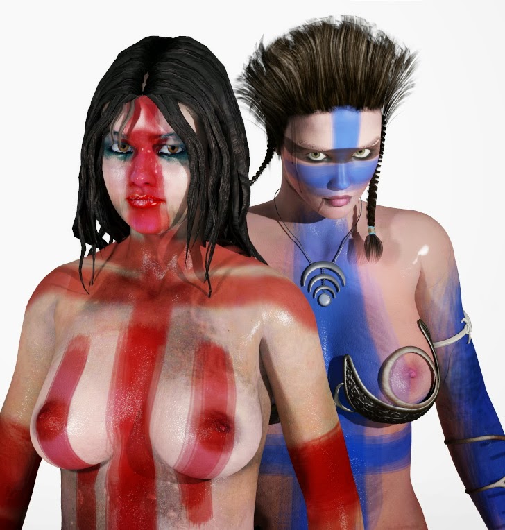
With the other two, you can see in the first one that the Madal warrior's skin looks a little too clean. So I went back to photoshop and added some more grime and darkened her skin. Make sure you apply any overall color changes to all the V4 maps (Torso, Limbs and Face) otherwise you'll have major texture seam issues.
By the way, check the Madal's hair. It's some Japanese manga thing I bought a while back. I morphed it a little bit to make it a little less neat. Could've made it even scruffier actually.
Scene setup
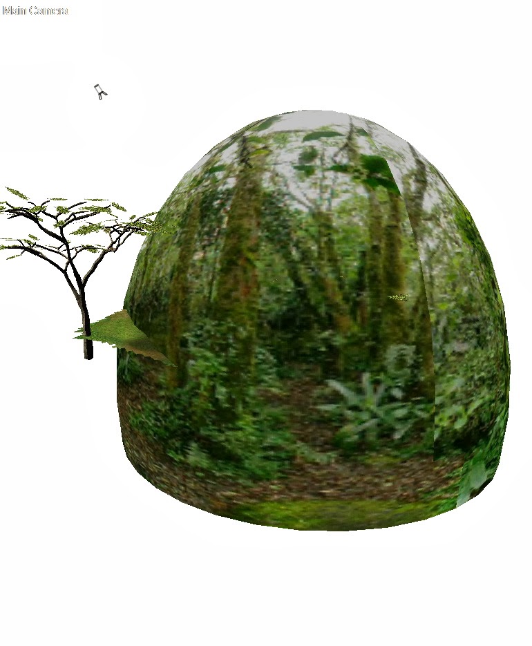 Ok so with the scene, I started with a sky dome I made in 3D Max which also has a floor to work with. In this case I didn't make use of the floor, just the 'sky'. I loaded up the same ground I used for the dream scene in 'The Route' (also self-made). Then I simply added lots of clutter, grass, dead tree stems. Never forget dead branches and that. For some reason we always forget them! In a proper forest its a fucking mess! We have some proper jungles a mere hour's drive from where I live and they are impenetrable. I've often had to hack my way to viewpoints.
The dappled sunlight is the neat thing about the whole scene and is very simple to do. It takes a little experimenting but all it takes is a 3D 'spots' node to the diffuse color of an infinite light. Jack it up to 400% and make sure your exposure in the render settings is about 1.6 or something. Don't forget IDL!

The materials for the ground it pretty insane, I'm not going to explain that. Basically, its got a crapload of masks allowing for nice stone protrusions and grass in the form of displaced noise, mixing all kinds of vegetation maps, some made by me.
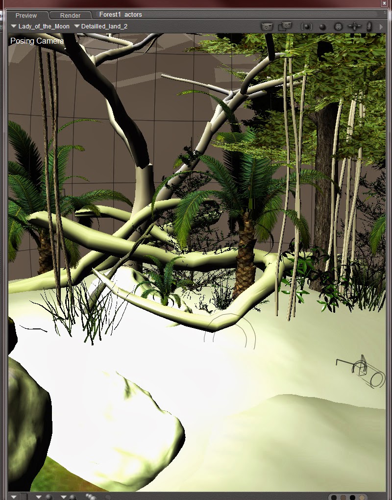 Some of the vegatation was made by me, in fact I made the vines especially for this scene. Its basically 5 cylinders in a row made in 3D Max and then in zBrush you just bend them a bit, move them around so it looks random. Export a version with only two or three vines, etc.
I'm quite happy with the result, but in future I'm going to try make some better props and transmap jobs. I actually just bought that enchanted forest thing over at DAZ but haven't tried it yet. Looks good from what I saw in the promo pics.
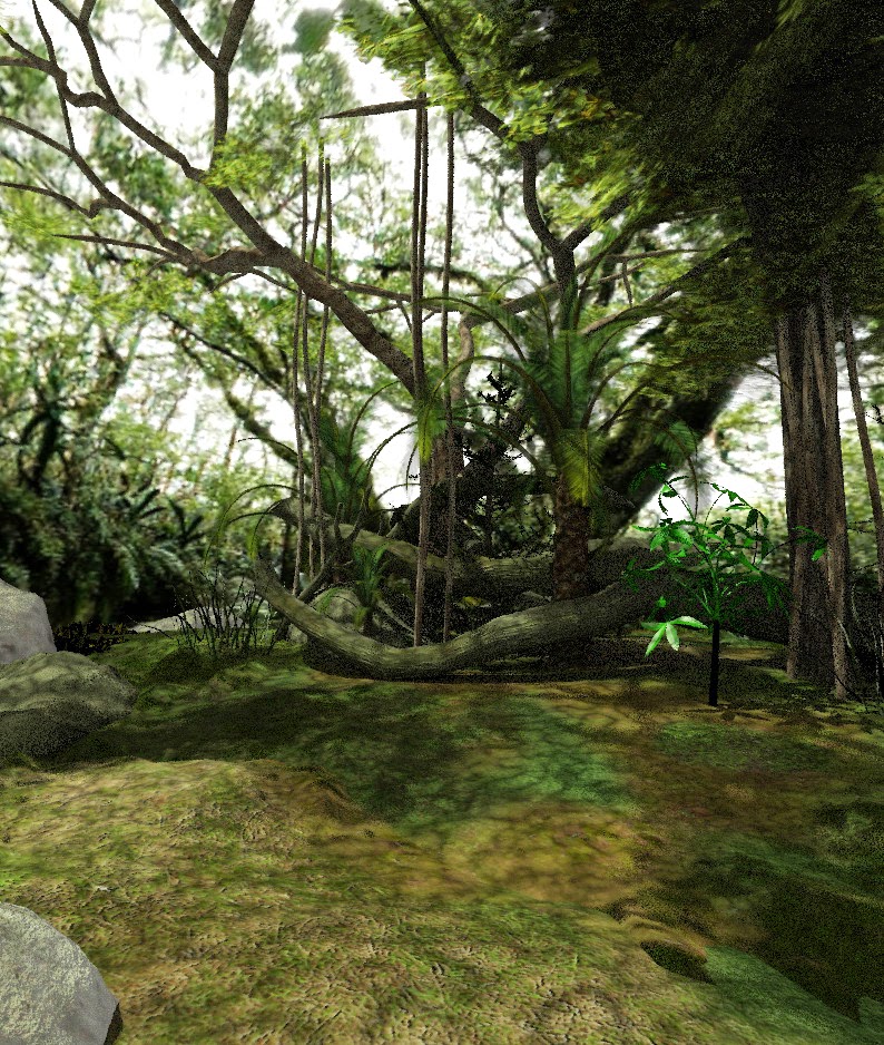 You can see the effect the 'spotted' sunlight has on the image. You mustn't zoom out too much or the effect will be too obvious. In these test scenes there's just one light, the sun. But further down the road I did add one more light, a spotlight in the same direction as the sunlight. I wanted to create the effect of a 'opening' in the forest canopy.
Oh and about clutter, make sure you fill up the edge of the scene because empty spots will fuck up the composition. You must hide away anything that will kint at it being a 3D render, like the ends of the vines that should be twisted around a branch, but was too lazy to do.

Environment test
Before you even think of posing your figures, you must make sure their skins work in the environment. And obviously also try it out in photoshop with masks and everything. Because the render is quite dark, you might miss something that will end up making your postwork harder.

Ok so now we can play!!!
Posing
Now it starts to get philosophical. I can spend hours getting a pose right, or sometimes I can nail it in a minute. It depends on the scene, your plan, experience and your mindset. This time I nailed it pretty quick because I already had a fair idea of what I wanted. I struggled slightly with the Madal warrior; at first she looked like someone swearing in Italian: "Cazo di merda!" so then I bent her over more, making her scream more intense.


So the mood will be extremely fierce and defensive, very tense. Depending on one's mentality, the way one deals with it can differ greatly. Sen is highly concentrated and has her knees bent to jump at any moment. She's moving around too, making herself a harder target. Her blade is out to the side, in a neutral position ready to swing it any way necessary. She doesn't know the Madal warrior.
The Madal warrior is more about intimidation and is doubled over as she exerts her lungs to scream at Sen, in an attempt to intimidate and unsettle Sen. Any flinch from Sen and the Madal warrior will strike instantly. The Madal warrior has one foot on a rock, solid ground.

Composition
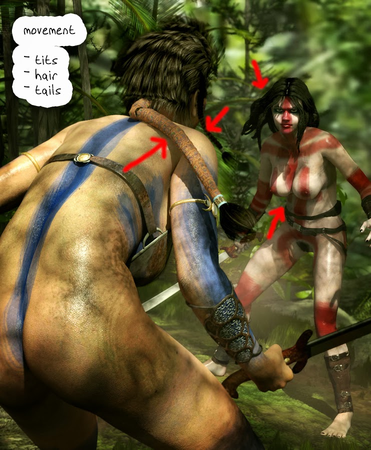 I believe posing and composition go hand in hand, if the poses are intense, then get in closer with the camera, for example. Get long shots going so that the depth makes the image more dramatic. And off course movement! Everything in your scene that can move, should be moving, especially if its an action scene.
 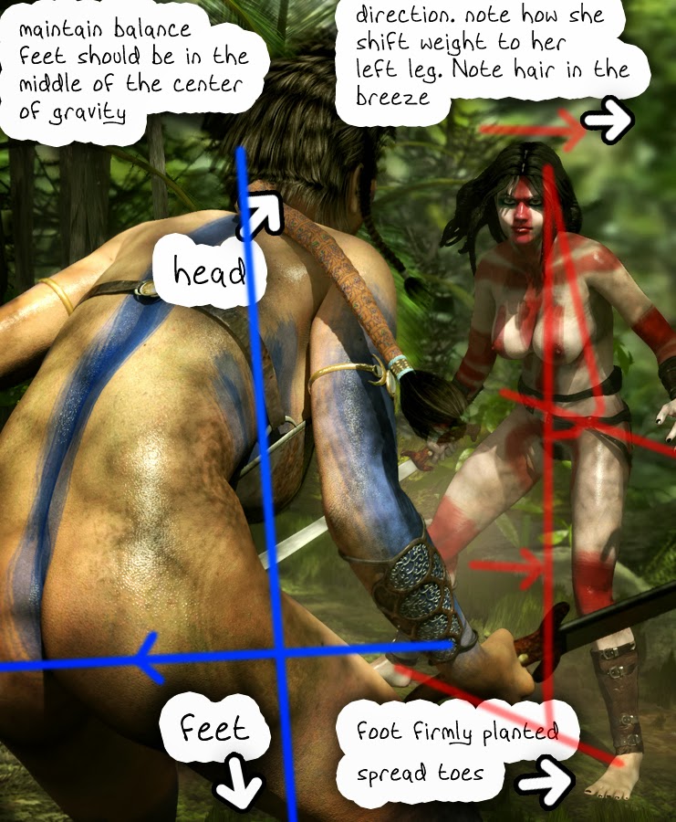 In this case its tits and hair, but also Sen's body as she steps to the side. Which brings me to the next important thing that 3D artists sometimes don't pay attention too: BALANCE!!! and putting the foot on the ground!!! In the scen you can see Sen planting her foot firmly on the ground, with her toes spread, dug into the grass. That conveys just as much movement as anything. Her center of gravity is leaning towards her left foot and her hair blows out to the right. Her tits dangle slightly to the right. The Madal warrior's mid torso is positioned over her feet.
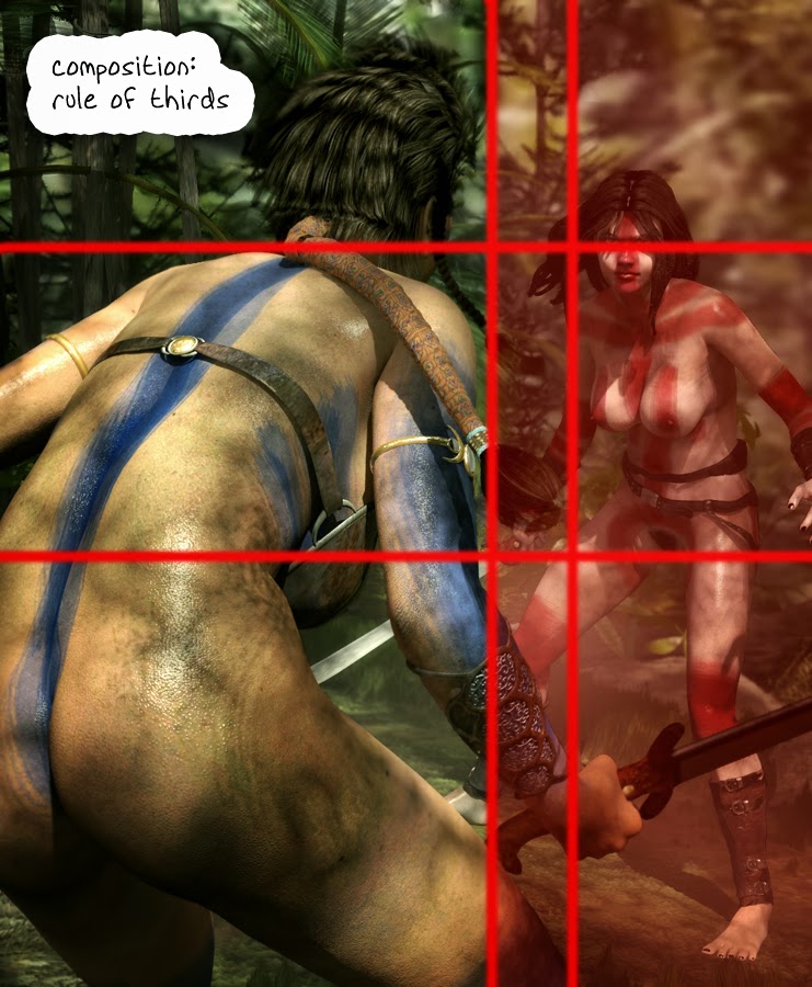 Then there's the artistic composition. Never put your subject dead centre of your art, unless it is a show piece. In such a dynamic / organic picture as this fight scene, you need to maintain that rule of thirds that we observe in nature all the time. Its not a strict rule, but it enlivens most artworks so much! Plus it add to the depth as the Madal warrior takes up a third of the scene by area as compared to Sen. Making the Madal warrior more intimidating.
Testing the scene
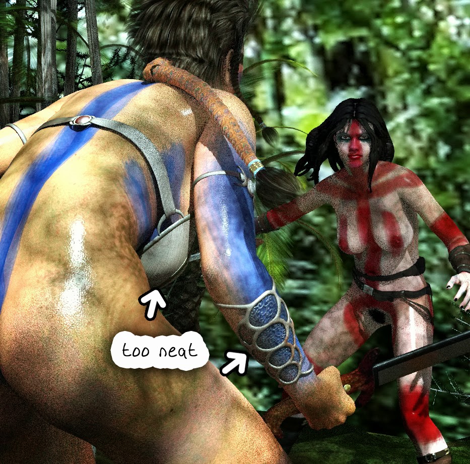 I usually use Progressive rendering for testing the scene, checking if the lights are in the right position. The test went well and I saw only one thing I wanted to change: her bracers, they looked too clean and neat, I needed to rust them up a little.
Postwork
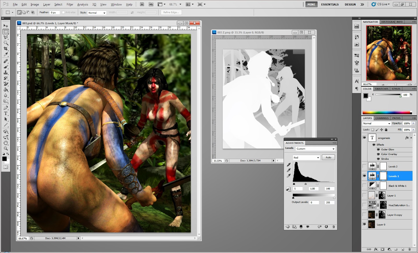
Ok now for the postwork, where the magic all comes together. I'll keep this short because I'm getting tired now hehehe.
 I start with getting some color going with the levels. I just let Photoshop do an automatic leveling. It usually does a decent job, at least to get started. Then I get the DOF in with the z-Depth mask that Poser exports if you set that up as auxiliary info. I use 'Lens Blur' for this, and all you do is direct the module to the z-depth image you pasted in the mask of the main image layer. Click on the part you want to be in focus. Then delete the mask. In this case the Madal warrior should've been blurred out, but her skin was so nice I didn't dare blur that out. So I airbrushed the madal warrior out with another mask to reveal the original below.
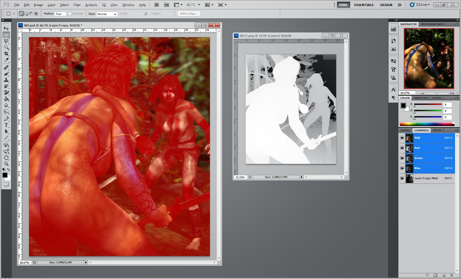
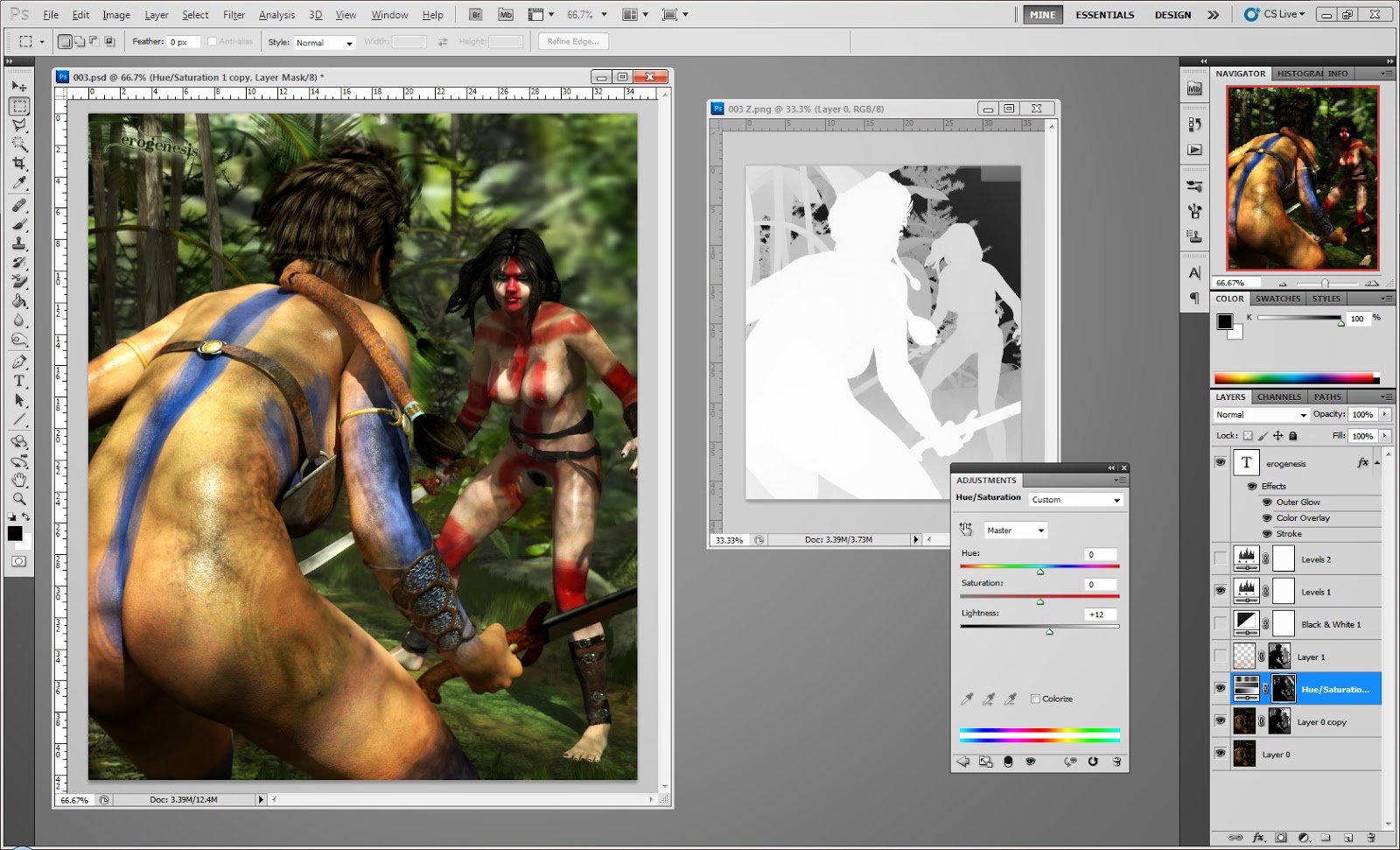 Then I add a hue/saturation layer and lighten is to give a hazy feel to the image. I select the channel tab and paste the z-Depth image, invert it, and viola, you've got 3D haze floating between the two characters.
Off course I touched it up with an airbrush to get some rays going, and darken parts of the picture that became too light for me.

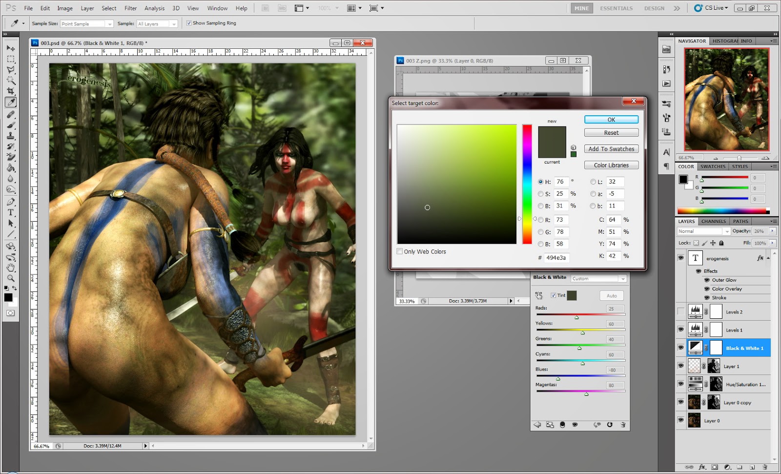 Finally I add a Black and White filter and give it a green tint. I then lower the opacity to something like 26% to give the scene a little bit of a green forest ambience.
And that's all there is to it :)
Awesome. Thank you so much for this tutorial. You have given me some new things to try.
ReplyDeletecool stuff to read.
ReplyDeleteI of course have to re-read it (and not only once, I fear) and I'm not sure how much of it I will be able to transfer into my own workflow (I'm such a dumb in Photoshop and all that other technical stuff)
but it's massively interesting to get an insight into how you're working.
Holy fucking shit! Excellent work man. This should be required reading with every purchase of PP2014. Thank you for sharing with us. You should stick it in a pdf and sell for 5 bones on Rendo. :D
ReplyDeleteVery informative. I've noticed you have a much newer version of photoshop, which gives you some advantages.
ReplyDeleteIn your Poser set up you're using a closed dome, which I stay away from. I usually always leave 1 end open like a studio set.
I like how you're keepimng the frame tight so that her expression helps tell the story.